
A Cooler Deck That Lets Walnut Cabinets Carry the Room
Walnut cabinetry looks richest beside a cooler honed solid that stops short of grey and leaves the timber as the warmer plane after dusk.
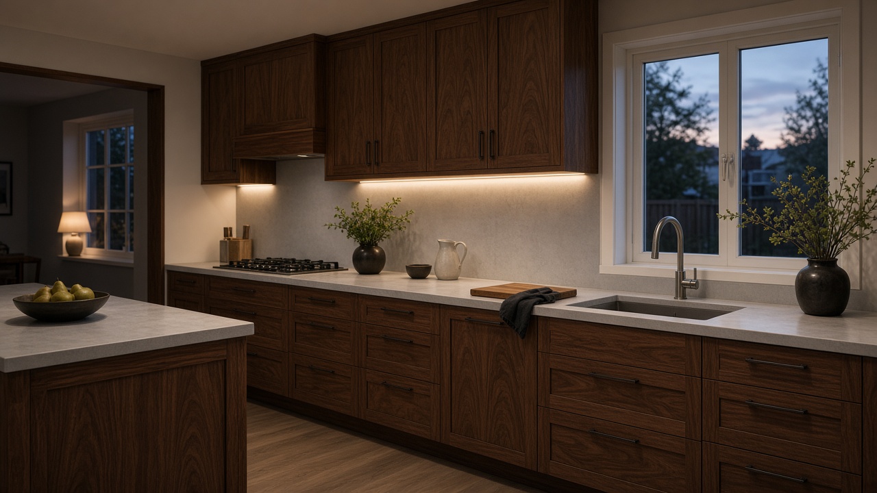
Walnut already supplies the warmth; the deck beside it should cool the room without sliding into a lifeless grey. Work-Tops treats that contrast as plane, edge and sink together, so the timber remains the surface your eye rests on when the lamps come on. A warm beige makes walnut look ginger, while a cold white turns it into office furniture.
Let the timber stay the warmer vertical
A Hackney terrace measured in February had full-height walnut in-frame doors and a basement window that barely reached the island. The board that worked was a greige acrylic with a faint mineral grain, honed, twelve millimetres at the sheet and built up at the nose to thirty-six millimetres so the lid felt equal to the doors. Do not match the worktop to the walnut. Match it to the shadow between the doors. If that shadow is chocolate, a cooler greige will lift it. If the shadow is already grey-brown, a soft putty or a muted graphite will do more than another timber-effect sheet.
Hold the sample against a closed door, not against an open shelf of white crockery.
Cool the grain without draining the colour out of it
Through-colour solids can carry a quiet mineral fleck that reads as stone dust rather than as a printed marble. That fleck is useful beside walnut because it stops the plane looking like painted board. Avoid heavy Carrara-style veins; they pull the eye off the timber and make a dark kitchen feel like a showroom set. Test the board against a door in evening light and again in the scrap of morning that reaches the sink. Walnut shifts red as it ages; a worktop with a green-grey undertone will still sit beside it in five years, while a yellowed cream will start to fight the grain.
Choose a honed face so lamp light sits in the plane instead of skating off it. Gloss next to oiled walnut is a sheen argument the timber should not have to win.
- Hold the sample against a closed door, not against an open shelf of white crockery.
- Reject heavy marble veins; they steal the contrast the timber is meant to own.
- Choose a honed face so lamp light sits in the plane instead of skating off it.
Stop the contrast before it becomes a second scheme
Upstands in the same solid keep the contrast honest. A tiled splash in gloss white will bleach the walnut; a dark metro tile will double the gloom. A sixty-millimetre coved upstand in the worktop colour lets the timber remain the only warm vertical. On a run that turns a corner, keep the same sheet so the join does not introduce a second colour at the exact place the eye already works hard. Handles and taps should pick a third metal, not a fourth timber. Aged brass or a dark bronze sits with walnut; chrome tends to chill it. The worktop then becomes the quiet field those metals land on.
If the walnut run is only three metres of galley, consider an integral bowl in the same solid. A stainless sink punches a cold rectangle in the contrast you have just built.
Place the join so the timber still leads from the hallway
Invisible bonded seams are the reason to use solid surface beside walnut rather than a quartz slab with a resin joint. A dark scheme advertises every mismatch. Ask for the seam to fall behind the hob or at a corner return, never in the middle of a 2.4 metre run you see from the hallway. Colour-matched adhesive should be mixed from the offcut, not guessed from a chart. Bond the bowl, keep the tap on a small deck, and let the timber remain the richest surface in the room.
Work-Tops will not cut a contrasting run until the walnut doors, or a large finished sample of them, are in the room. Near-miss timber is how these kitchens go ginger.
- Place bonded seams behind the hob or on a return, never in the main sightline.
- Use adhesive mixed from the actual sheet, not a generic charcoal cartridge.
- An integral bowl keeps the contrast in the cabinets, not in a steel rectangle.
Next step with Work-Tops
Order a sample, then request a fitted quote or browse the worktop collection. The colour should be judged in your own daylight before anyone templates the run.